Chapter 13 is up!
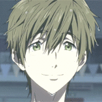
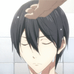
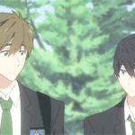
Relationship: Nanase Haruka/Tachibana Makoto
Rating: Mature
Summary: He thought he had overcome it. He thought he had grown up from the
childish fears of imaginary things lurking in the water. Well, in the
pool – there was always something in the ocean – but there was nothing
at the bottom of the contained space other than textured concrete and
rippling shadows from the surface. Yet, somehow, he couldn’t stop how
his chest weighed heavy even after he’d be done swimming for the day.Chapter summary: Research, studies, and another match made.
Updates will be weekly!
Tag: free
Pst. Do Free, cause, we are always free.
OKAY!
The first character I first fell in love with: Haru, of course. He’s just the sort of character that I immediately latch on to. Obviously.
The character I never expected to love as much as I do now: Nagisa, probably. That character type typically annoys the heck out of me, but I ended up really loving him. Thugisa probably had something to do with that…
The character everyone else loves that I don’t: You know, honestly, I think I like everyone in Free! at least as far as canon goes. There are certain fan interpretations that make me roll my eyes, but no one in the series is great.
The character I love that everyone else hates: Hmm… a lot of people think that Haru is really whiny (he is), but I doubt most people hate him. TBH, I can’t think of anyone that is downright hated…
The character I used to love but don’t any longer: Everyone has managed to maintain their awesomeness.
The character I would totally smooch: EVERYONE would get a kiss on the forehead and a hug. They all need it. Precious babies.
The character I’d want to be like: Rin, maybe.. at least now that he’s calmed the heck down. I admire his confidence and drive, and how he really cares about people.
The character I’d slap: Momo, probs, and tell him to stop being so grabby.
A pairing that I love: Ugh. All of the. Makoharu, Sourin, Reigisa, etc etc etc… I’m really fond of Kisugou, too, which I guess it p unusual.
A pairing that I despise: I don’t know. All of the characters are great, though I’m not fond of hate ships… so the whole RinHaru thing is annoying and I like them MUCH better as friends/rivals. Plus if you have Rinharu you can’t have Makoharu and Sourin and that is just a crime. D:<
Oh I also am strongly opposed to the idea of Kisumi being everyone’s first kiss. Like wtf guys.
Kisumi fox! Still needs some work on the design but it’s a start.
Kisumi fox! Still needs some work on the design but it’s a start.
Show Chapter | Archive of Our Own
Show
Chapter
|
Archive of Our Own
Title: Wait for Me
Relationship: Nanase Haruka/Tachibana Makoto, Background SouRin, Background Regisa
Rating: Mature
<i>He thought he had overcome it. He thought he had grown up from the
childish fears of imaginary things lurking in the water. Well, in the
pool – there was always something in the ocean – but there was nothing
at the bottom of the contained space other than textured concrete and
rippling shadows from the surface. Yet, somehow, he couldn’t stop how
his chest weighed heavy even after he’d be done swimming for the day.</i>It’s here! It has been a year since I’ve started this 100k+ MakoHaru collaborated fic with @gabapple and it is now ready to be read! Going to try and have a new chapter weekly or bi-weekly!
Please check it out :>
😀 hAHAAAHAHAHAHAAA reblogging this here because I had a part in it.
