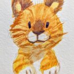
Tiger! 🐯
…
#tiger #watercolor #art
https://www.instagram.com/p/CFsG-UaDrB9/?igshid=1qqaz2ovwm65y
Tag: art

Finally, I can post one of the pet portrait commissions! This is a double for ForsakeAngel88 – pups Raul and Aliyah, begging for their customary schmacko treat. :9
This was done in Photoshop. I had too much fun. I love dogs, and these guys are WAY too cute. Thank you!!!

April’s Rabbit Rabbit piece for patreon was of Barnaby from Tiger & Bunny! I love him and I love T&B and I love my patrons, so thank you for your support!
I’m thinking of offering full-color pet portrait commissions starting in March to get some moving funds together. 🤔
…
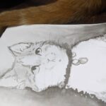
#pets #cats #art #nugget
https://www.instagram.com/p/B9Ct7VvJtk4/?igshid=1glxkgwg8nqd7
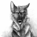
Arlo for #inktober!
.
.
#germanshepherd #dogs #art #ink #inktober2019
https://www.instagram.com/p/B3sG_esAwps/?igshid=b9gin8k8cuzg
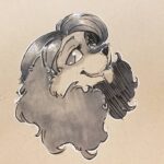
A Meryl for Friday
.
#dog #cockerspaniel #anthro #furry #art #tonedpaper
https://www.instagram.com/p/B2FMODEgwFj/?igshid=gj8gvq62jtd0
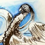
A bird! #art #bird
https://www.instagram.com/p/B0EX-CtFdPW/?igshid=8zagwlk3r98i
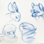
Drawing animals, thinking about fables…
…
#animals #art #drawing #rabbit #bunny #fox #sheep #crow #corvid #fable #sketch #blue
https://www.instagram.com/p/By3RnsrAGis/?igshid=57sqredreezh
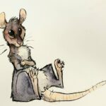
Rats from today
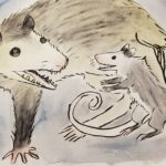
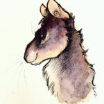
OPOSSUMS!!!! :V V: